S&P Global · 2025–2026
S&P Global: An AI-Native Design System Adopted Into Production
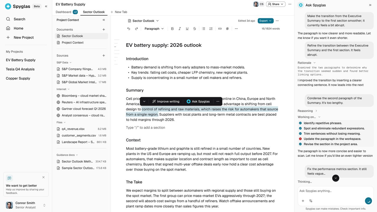
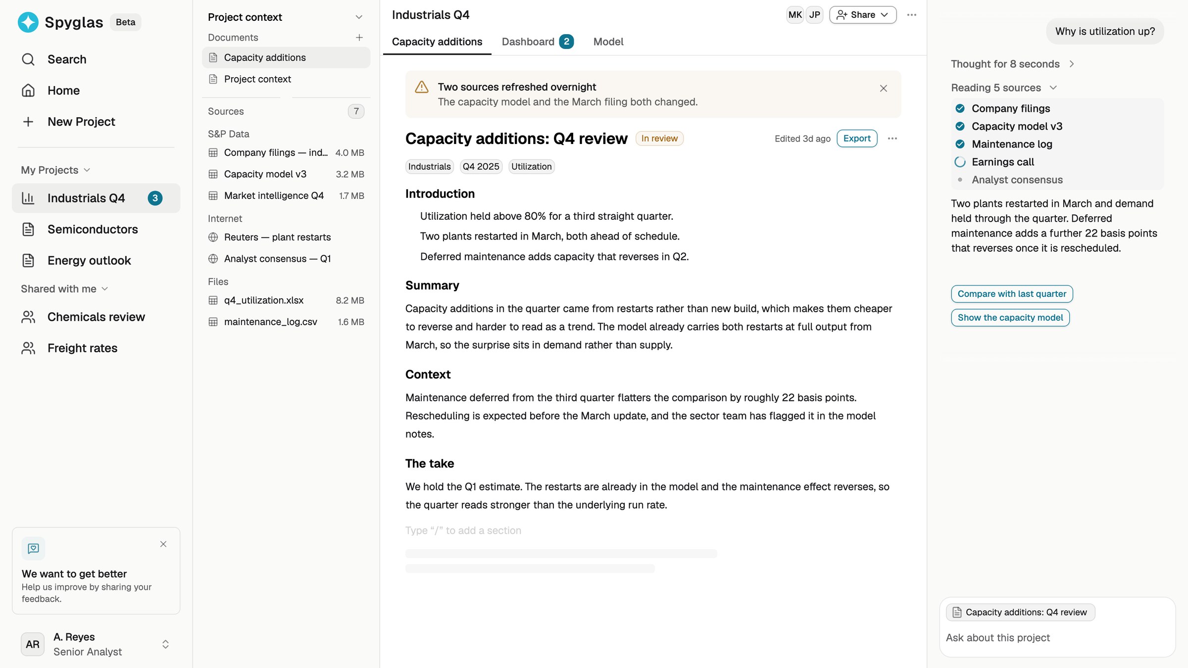
I designed an AI-native design system as an internal product for teams creating and evaluating product ideas. Designers, engineers, PMs, and analysts could describe a flow in plain language and get a working React prototype built from real components, semantic tokens, and product context. What started as prototyping infrastructure later became part of the production application.
Audit
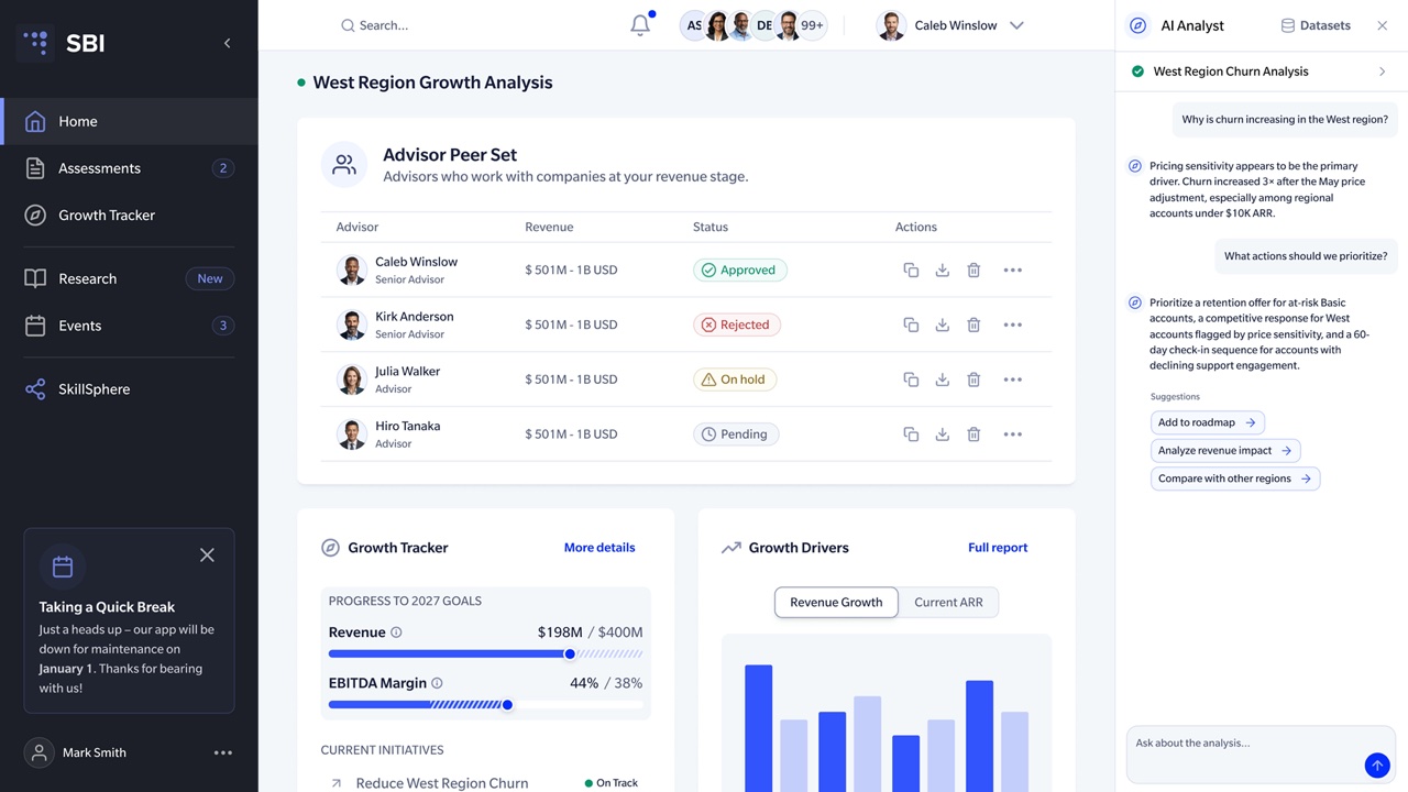
I designed the product experience of an AI research workspace (opens in a new tab) for S&P Global analysts and built the system beneath it. This case is about the internal product used to create, test, and implement that experience.
The interface was becoming the constraint
S&P Global already had an internal AI platform where employees had created thousands of tools. Most ran through chat.
One employee wanted a form-based workflow with structured fields, instant preview, and one-click regeneration. The model could do the work, but the platform could not support the interface, so she built it elsewhere.
I saw the same problem in product prototyping: teams could describe interfaces faster than they could build realistic ones.
What I inherited
The existing system had three structural problems:
- the production React library was tightly coupled to backend services
- Figma had fallen behind several product iterations
- tokens, accessibility checks, and component coverage were inconsistent
Designers could create static flows, but not realistic product behavior. Engineers had to reinterpret those flows during implementation. AI could generate interfaces quickly, but often used the wrong APIs, skipped semantic tokens, or missed established patterns.
The goal became one shared system that design, product, engineering, and AI could all work against.
Foundation
Before improving generation, I rebuilt the foundation.
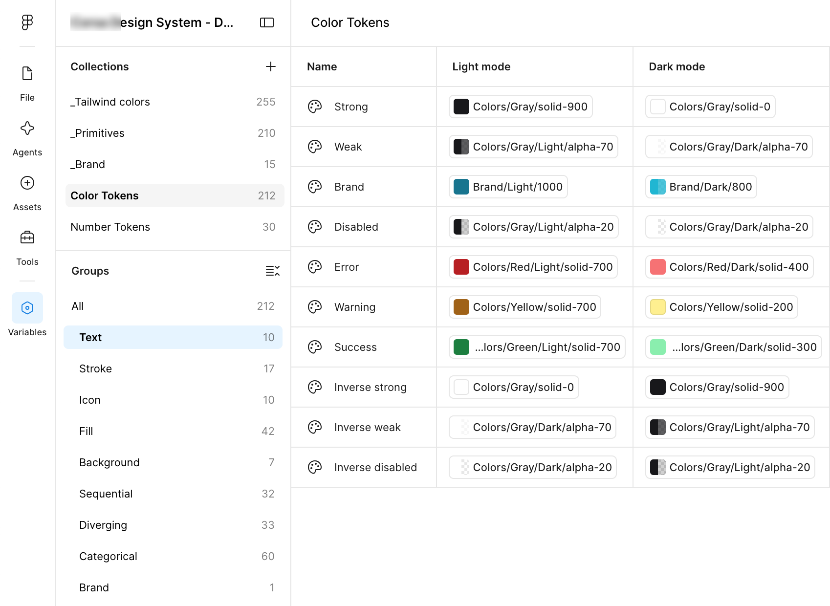
I created a decoupled React library for prototyping, introduced a semantic token layer, and aligned component names and props across Figma and React. Four token layers keep brand and light/dark on separate axes, so components never need to know which brand or theme is active.
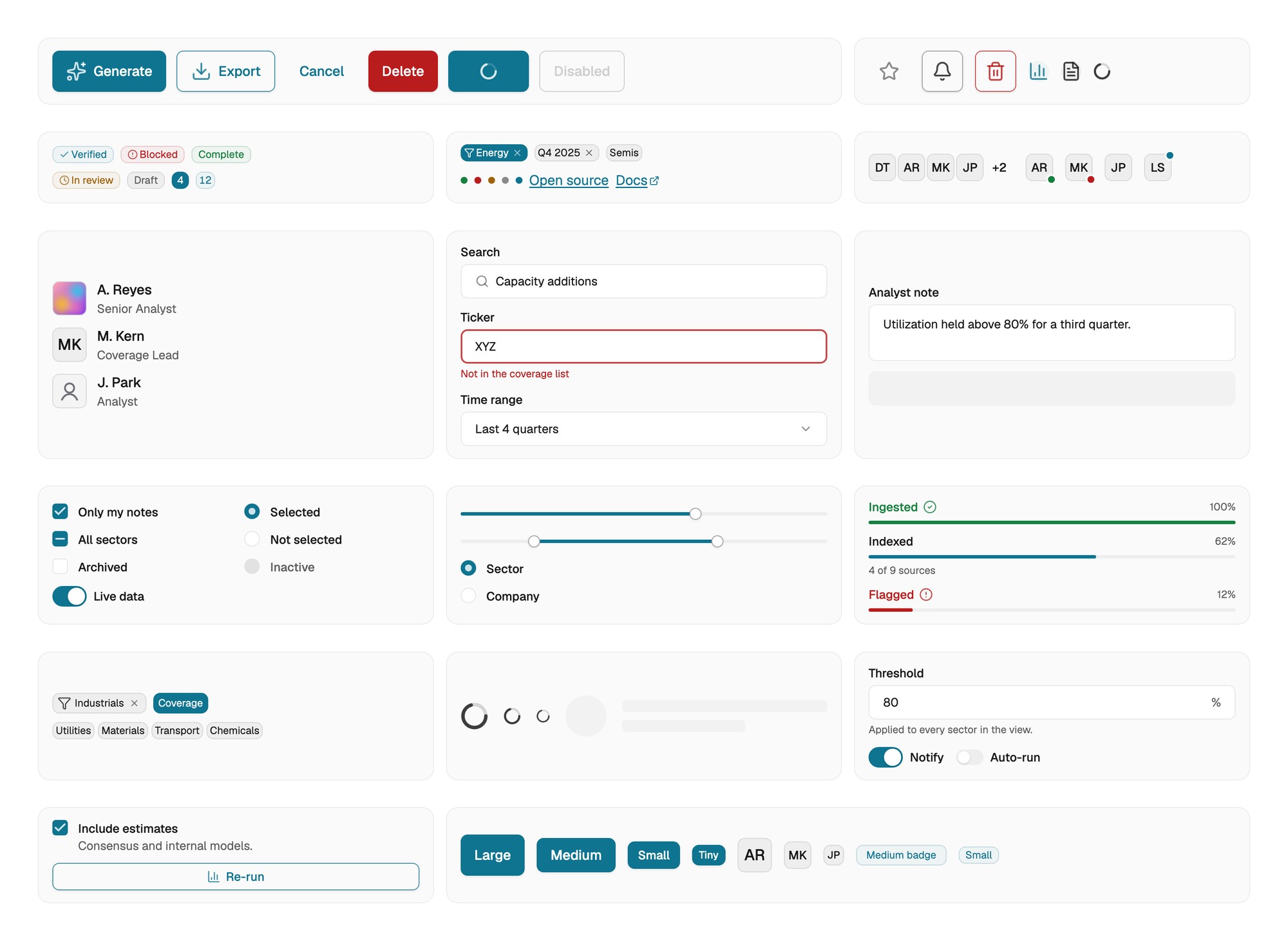
Tokens and components
Design, engineering, and AI should read the same system vocabulary.
The deeper architecture, from token layers and theming to accessibility and governance, is on my design systems page (opens in a new tab).
Parity
One component, two tools
I connected the Figma library to the React source with Code Connect, so a component in Figma shows the code engineering actually imports. Storybook controls are generated from the TypeScript props, so designers and engineers use the same names.
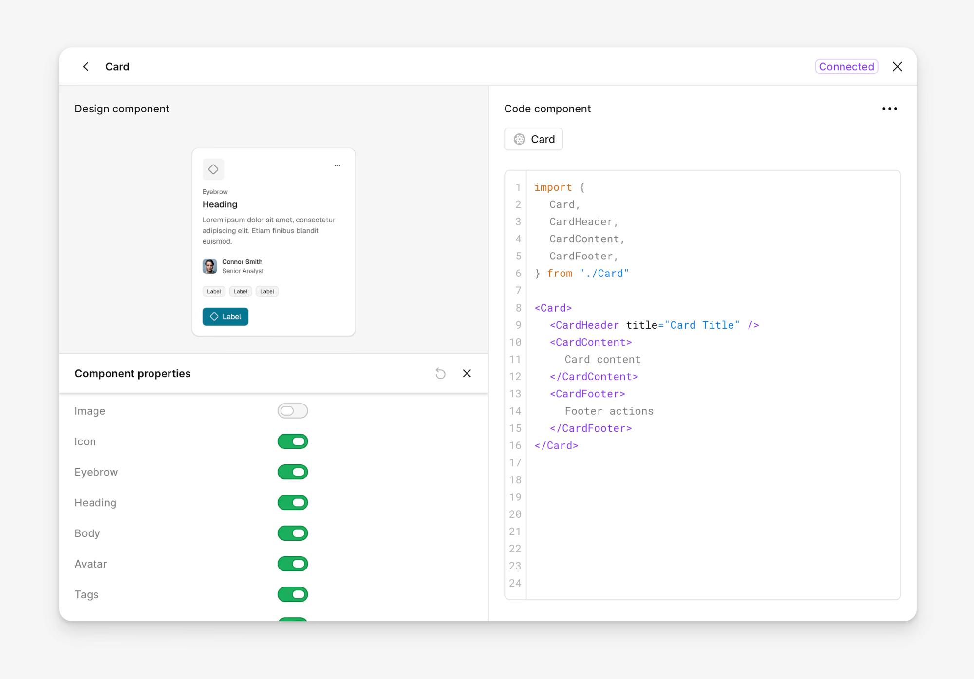
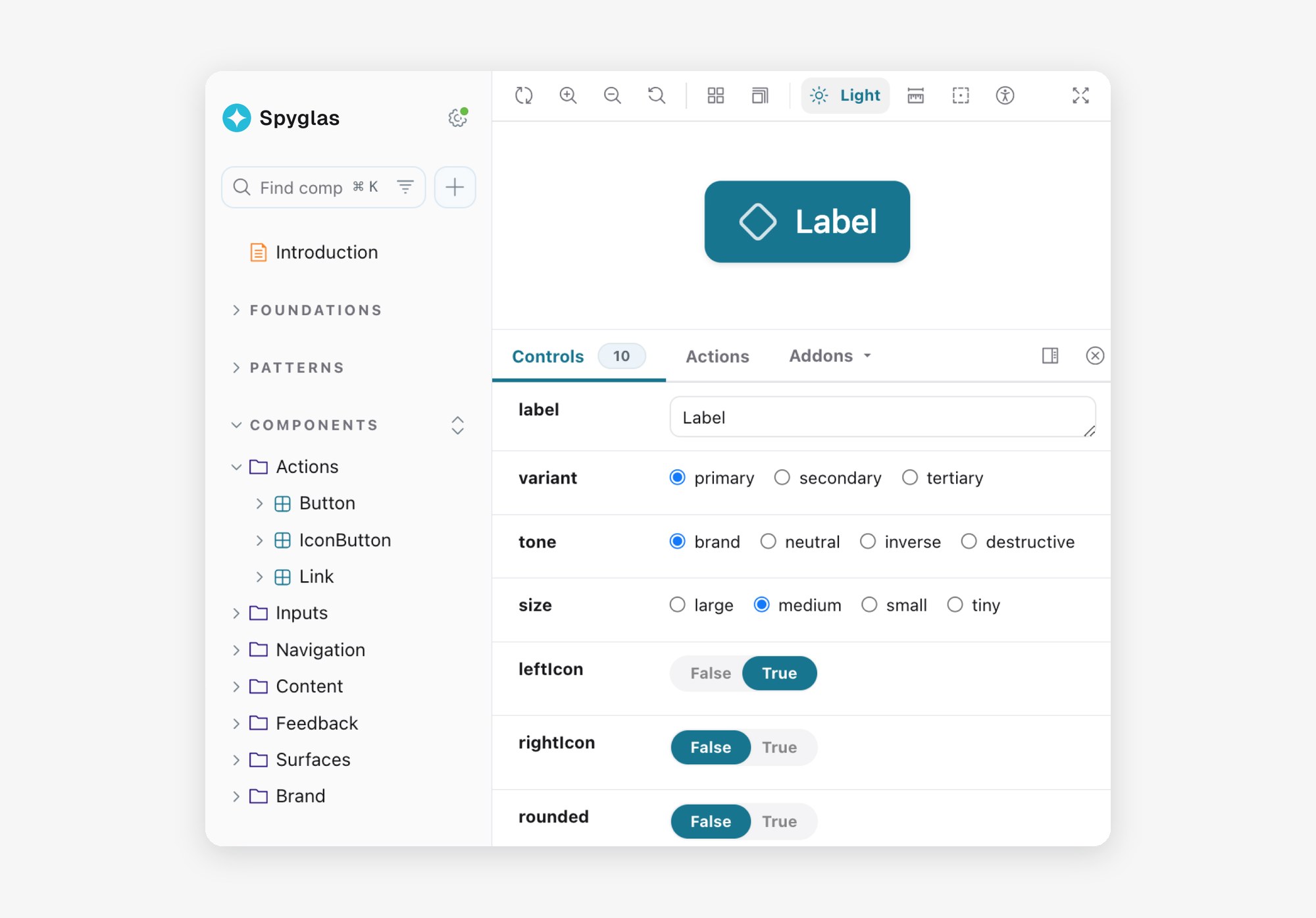
Figma and Storybook
A model that reads the source reads the same contract, which is what made the AI workflow possible.
A name means the same thing in Figma, in the code, and in the prompt.
Failures
Four errors kept coming back
I reviewed prototype sessions, recurring corrections, and generated output. The same four failure modes appeared repeatedly.
Guessed APIs
AI used real components with unsupported props or variants.
Invented components
When it could not find a pattern, it created one that did not exist.
Hardcoded values
Generated code bypassed semantic tokens and drifted from theme and brand rules.
Missing patterns
Required structure or behavior was left out, creating fragile interactions and accessibility issues.
Setup created more friction too. Projects took 15–20 minutes to configure, users had to know what components existed, and product context had to be explained again in each session.
These were not random generation mistakes.
The model did not have reliable access to the current system.
Drift
Documentation helped, then became another source of truth
My first version used written component contracts. Each file described accepted props, required patterns, tokens, and common mistakes.
Generation improved. But the contracts drifted whenever the implementation changed. A renamed prop could make the instructions wrong even though the component source was correct.
I tried two more approaches:
| Iteration | Improvement | Limitation |
|---|---|---|
| Written contracts | Exposed component rules during generation | Drifted from implementation |
| Hook enforcement | Caught known errors after generation | Still depended on copied rules |
| Richer context | Improved product awareness | Added maintenance and token cost |
All three relied on maintained copies of the source.
Documentation describes code. It isn’t code.
The screen below shows what that costs. On the left is the same workspace as generation produces it from a copy of the rules: colour picked by hand, a layout that ignores the pattern, components invented where the model could not find one, and states that were never built. On the right it is assembled from the library itself. The left half is a demonstration of the four failure modes, not a captured failure.
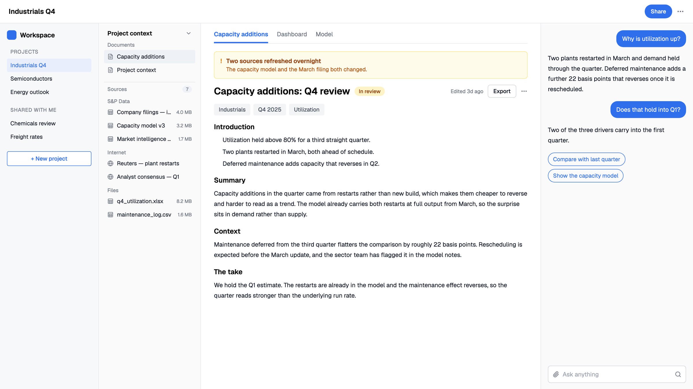 Without the systemWith it
Drag to compare
So I stopped adding more documentation and connected the AI workflow to the implementation itself.
System
Reading the source instead
I built an MCP server inside the design system repository. It gave the AI workflow direct access to live component source, TypeScript definitions, design tokens, and product context.
The workflow had four jobs, and seven tools to do them:
| Stage | Tool | What it returns |
|---|---|---|
| Setup | scaffold_project | The project, pinned to the versions the library needs, with the server wired into it |
check_setup | What the environment is missing, and the fix for each thing | |
| Understand | get_product_context | Product terminology, users, principles, accessibility rules |
list_components | The components that exist, and what a project needs to run them | |
| Build | get_component | Props parsed from the component source at the moment of the request |
get_tokens | Semantic tokens and the CSS variable names that carry them | |
| Validate | check_project | Where a project drifted from the system, with a fix beside each finding |
If the AI needed SideNav, for example, it read the current TypeScript API instead of a copied description of it.
That changed the workflow:
- users no longer had to explain the design system manually
- generated UI reflected the current component APIs and tokens
- engineers reviewed working code built from the same source they maintained
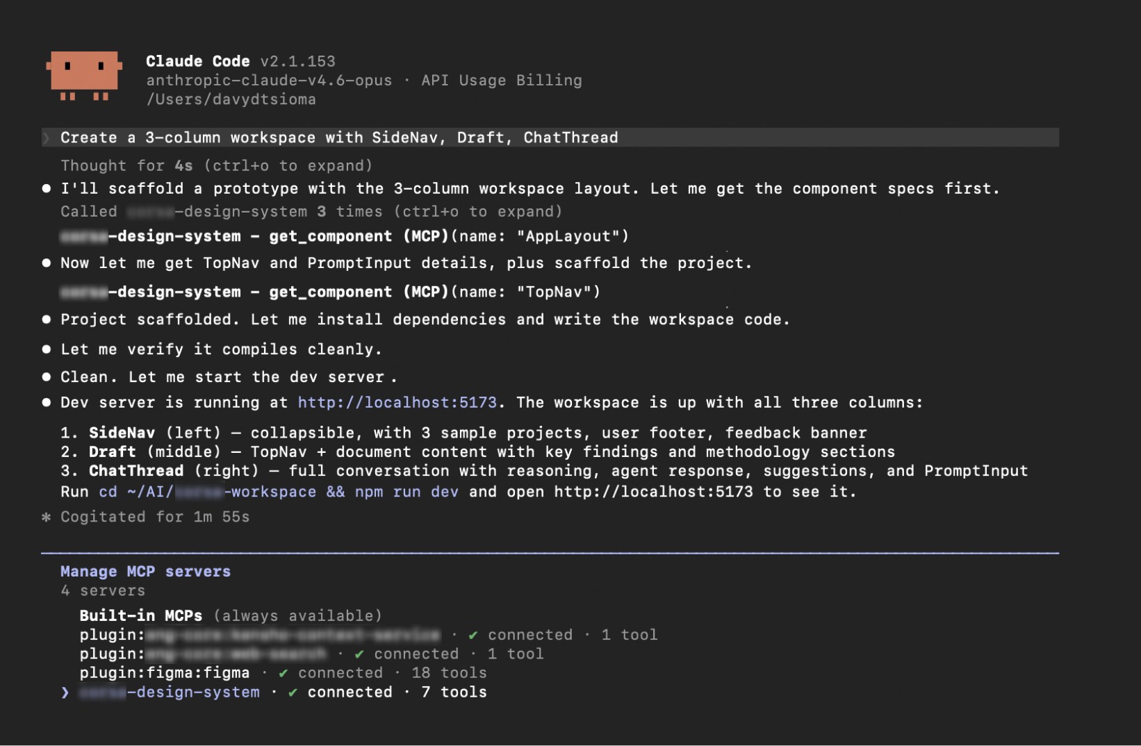
One session, start to finish
The agent reads the components over MCP before it writes anything. That run took 1 minute 55 seconds, and the server it called is listed at the foot of the session with its seven tools. The product name is blurred; everything else is the session as it ran.
Enforcement where errors were expensive
Live source reduced drift, but source access alone was not enough.
I added typed APIs, token checks, project validation, and stronger constraints around the few patterns that repeatedly failed.
Four higher-risk components used sealed, data-driven APIs that rendered required structure internally. Lower-level components stayed composable.
Strict where mistakes were expensive. Flexible where exploration mattered.
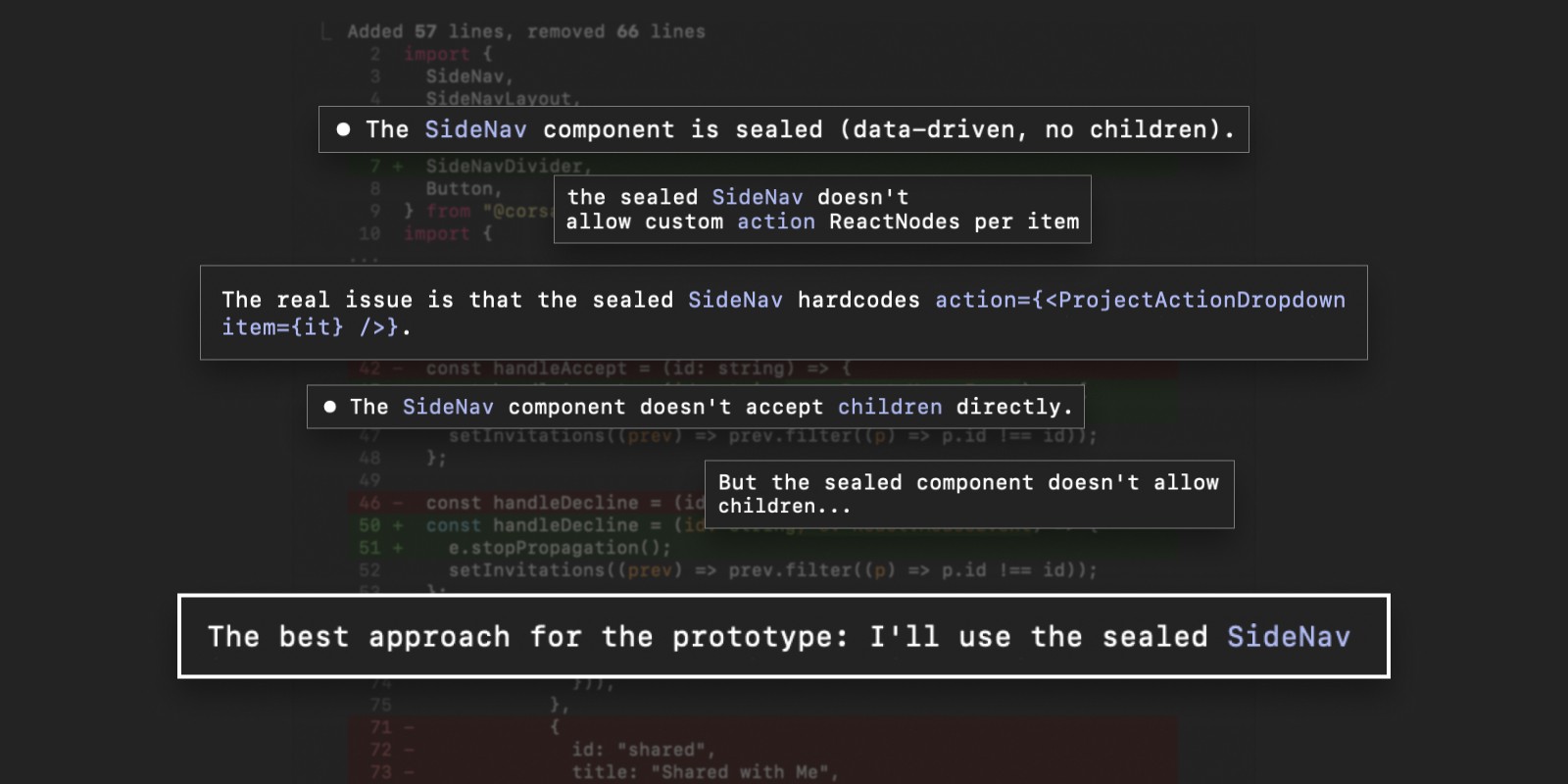
The type check holding a pattern
Accessibility
Carried by the components, not by a checklist
The system targets WCAG 2.2 AA, and the rules sit inside the components rather than in a document beside them: focus rings from a token, labels and error wiring built into form controls, 24px minimum targets, and reduced motion respected.
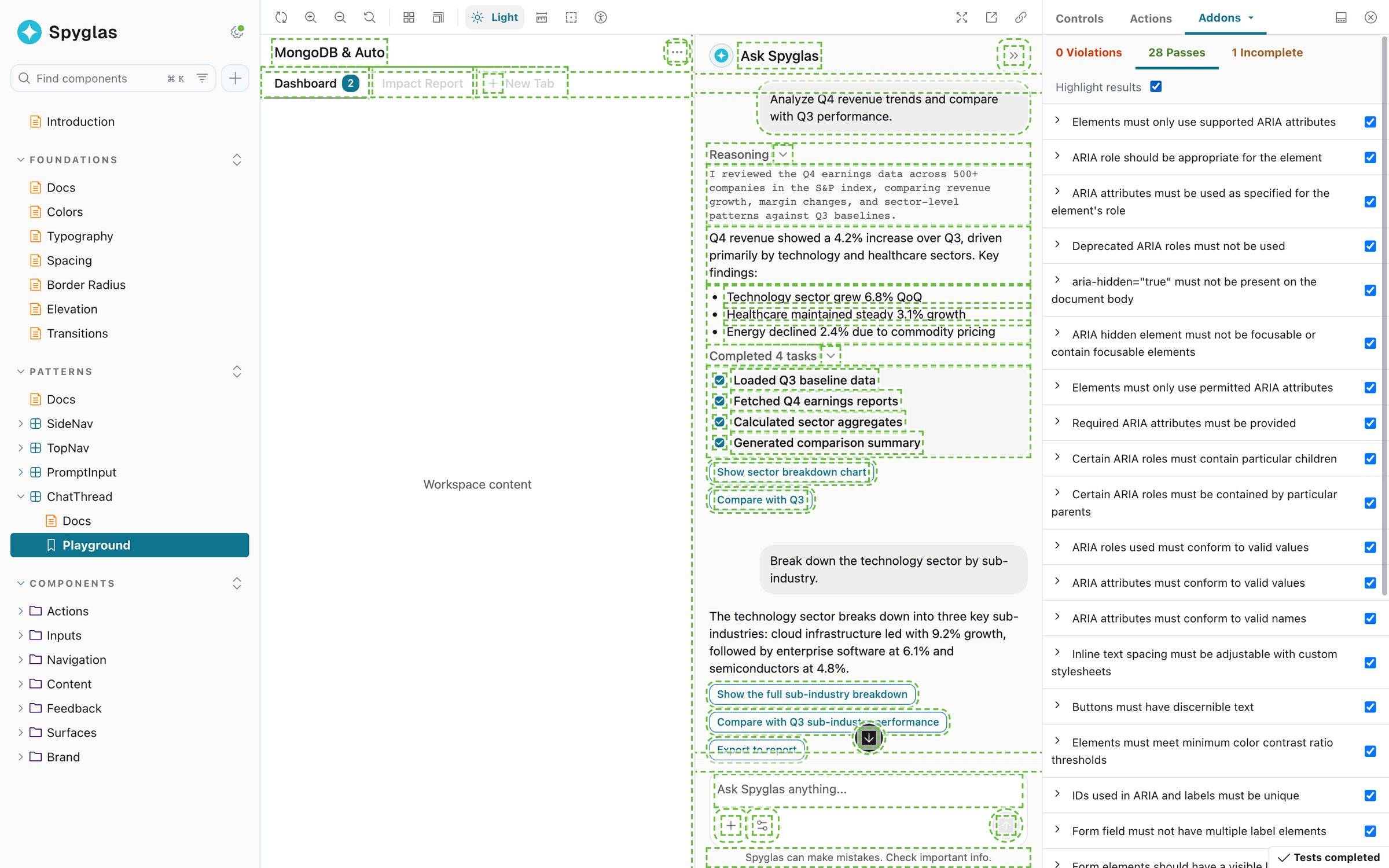
Checks beside the component
Generated screens inherit accessibility from the components they are assembled from.
Collaboration
Prototypes stayed close to the code that generated them, so teams reviewed working behavior instead of a separate handoff artifact.
Design and engineering in one repository
Design changes arrived as pull requests next to engineering's and were reviewed the same way. Prototypes were published to a gallery beside the repository, each linking to the running version and its code.
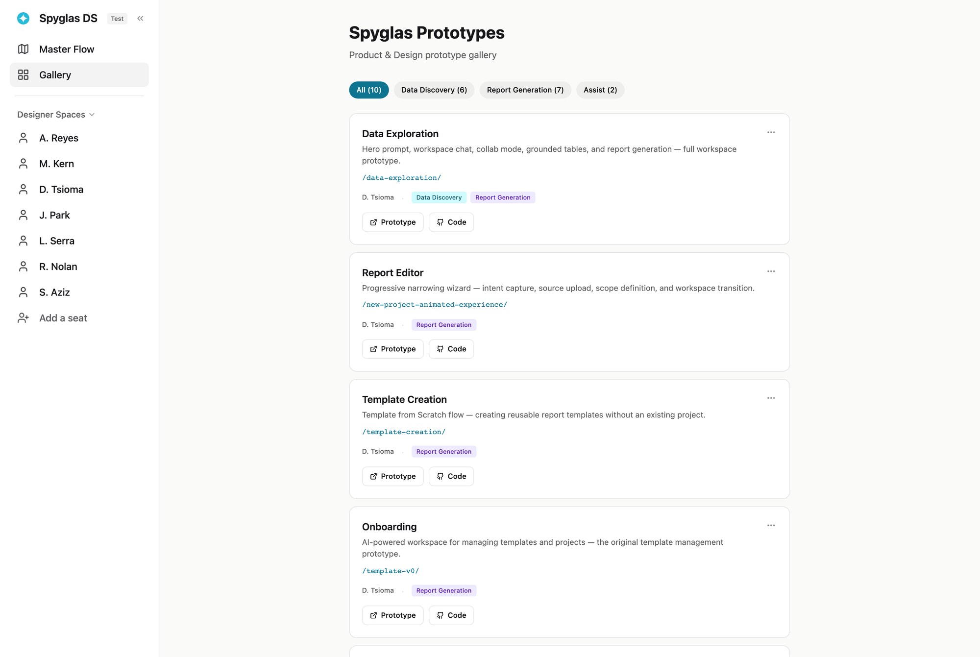
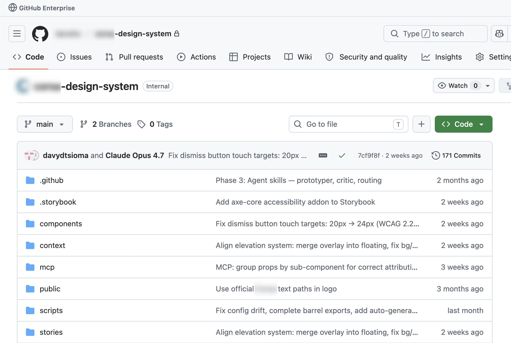
The gallery and the repository
I also built page-level commenting and a visual prototype-flow interface to make review easier, and have since rebuilt both from scratch as open-source tools: comments (opens in a new tab) and a flow map (opens in a new tab) for coded prototypes.
Adoption
Adopted as a workflow
The system changed the cost of producing a realistic prototype.
1 cmd
project setup, down from 15–20 minutes
< 2 min
from prompt to a working React prototype in a typical flow
Designers, PMs, analysts, and engineers could generate and review product flows without setting up a React project or memorizing the component library.
Product context loaded automatically. Revisions happened in plain language. Validation ran before review.
Engineers could inspect behavior and implementation earlier, instead of receiving a static handoff at the end.
Adopted into production
The stronger outcome came later.
I had intentionally built the prototyping system as a decoupled React library, because the original production components were tied to backend services.
After reviewing the repository, component APIs, and token pipeline, a senior software engineer proposed using the new library as the production implementation rather than maintaining two systems.
“Let’s repurpose [the design system repository] into the new component library implementation, replacing current front-end components in favor of [its] equivalents.”
Senior Software Engineer, S&P Global
The production application now imports the design system as a dependency, and engineers are replacing legacy components through regular pull requests.
Engineering also began shaping the architecture itself. The system moved from something I built for prototyping to shared infrastructure owned across design and engineering.
I later presented a three-stage AI-assisted UI roadmap to product and engineering leadership: cross-functional prototyping, agents assembling connected flows, and workflows that keep generated UI aligned as the product changes.
The larger lesson was not that AI could generate interfaces quickly.
Generation became reliable when the design system itself became machine-readable, enforceable, and shared with production.
Tradeoffs
Stronger constraints reduce flexibility
I sealed only the four complex components where misuse created repeated problems. Applying the same restriction everywhere would have made legitimate exploration harder.
I would involve engineering earlier
Separating the prototype library was useful because it let me move around the backend coupling quickly. Earlier engineering involvement, however, would have improved naming, API decisions, and migration planning sooner.
I would formalize package governance earlier
Once the library became shared production infrastructure, versioning, release ownership, and dependency management became more important. I would introduce an internal package and release model earlier next time.
AI increased implementation capacity, not ownership
I used Claude Code to accelerate implementation. I remained responsible for the product strategy, workflow design, architecture, constraints, validation, and adoption plan.